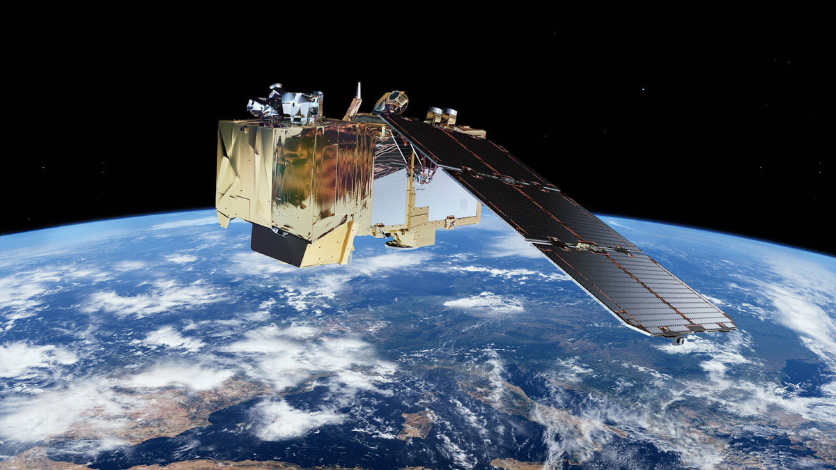
This compressed batch of data is called the Instrument Source Packet (ISP) or Level-0 raw data. It’s the source for all the subsequent data products.
How data is processed
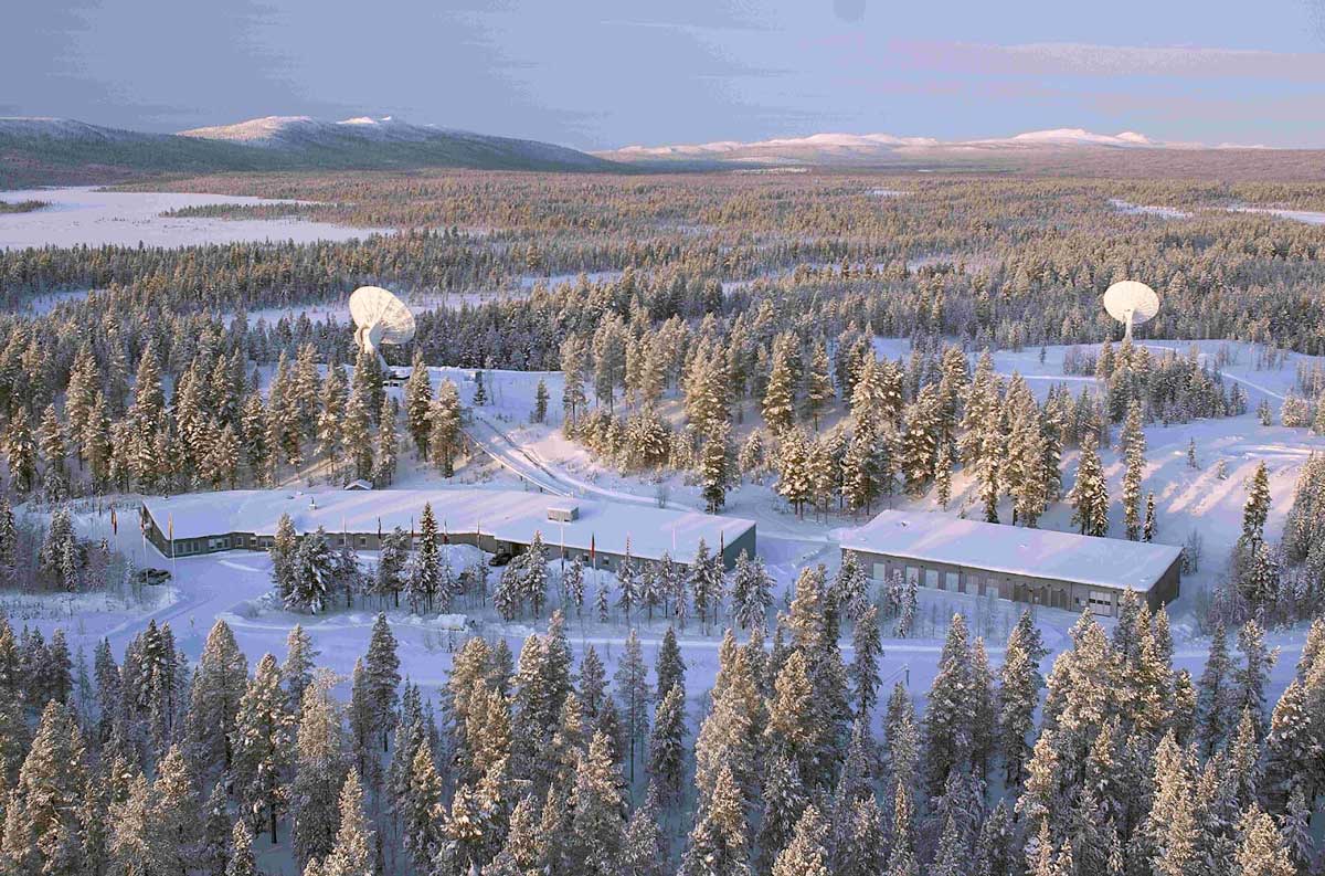
The data is stored aboard the satellite until it passes over a ground receiver station. At this point, the data is transmitted to Earth and the next stage of processing begins. The data is decompressed and every pixel is assigned to a geographic location. Finally, a process called radiometric correction is performed to prepare data for further processing.
Afterwards, the data is sorted into the tiles and bands that we are used to seeing in platforms like
Soar. Basic geodata masks are created to classify the image into broad categories, e.g. clouds, land and water.
The product available at this stage is called Level-1C
Top-Of-Atmosphere(TOA) data. This is the primary source for all further data applications and is also the first data layer that is
available for all users. This is the source for all subsequent downstream products and imagery that we see across media.
The next stage sees the Level-1 data adjusted to take into account the changing nature of the atmosphere and surface of the earth. For example, the same area can look very different as the seasons change throughout the year. In winter, an area may be covered with snow and sparse vegetation. In the spring, the vegetation is blooming, while autumn creates shades of red and yellow from the changing leaves on the trees. On top of these factors, events like wildfires or dust storms can partly obscure the scene.
To remove this ‘noise’, we need to account for variability in environmental factors that affect the data. The most basic adjustment deals with the darkest and brightest pixels in a scene. The best examples of this are snow-covered pixels that reflect most of the light, and open-water areas where water absorbs most of the light. Other processing is done to account for things like transparency of the atmosphere (dust and smoke presence).
It’s impossible to take into consideration every single nuance and in most cases it’s also not necessary. The rule of thumb is to tune your data depending on the size of the area of interest and spatial resolution of the sensor at your disposal. Once atmospheric corrections have been made, this data is labelled as Level-2 Bottom-Of-Atmosphere(BOA) data.
Finally, there’s Level-3 data. No data transformation happens at this stage and it would be best described as filtering the available data. This allows the data to be moulded for specific use cases, such as conducting
vegetation analysis, as well as deploying machine learning models on top of the data to perform a variety of other tasks.
This can be considered as a summary of best measurements over a certain period and area. It’s done by extracting the measurements from a time period to create a single image. Best known examples for Level-3 data are cloudless mosaics of a specific country or monthly
Sea Surface Temperature maps.
From data to maps
So, which data is best suited for you? Well, it depends on what you want to create and the computing resources at your disposal.
From an analytical viewpoint, you’d want to manage the processing details and settings used for atmospheric correction. So, a scientist or a private data centre will usually rely on Level-1 data as the source. Then, depending on the task, the processing chain is tweaked (or created from scratch) to control the processing steps and produce sets of Level-2 and Level-3 data.
For the majority of users, Level-2 data is the primary choice for map production and event analysis. The main benefit here is that the data holds ‘cleaner’ pixel values. This allows production of crisper images and easier comparison of data gathered on different dates.
Level-2 data also provides a sophisticated scene classification dataset (grouping pixels based on their similarity). For example, if you're interested in mapping desert expansion, you could use only the data layer with information about areas marked as desert. Similarly, you can use water pixels to map a flooding event by overlapping pre and post event imagery and calculating the area of the flooded area. This means that you can reduce the required data amount and simplify the processing.
With all this in mind, let’s also take a look at how you’d go about creating your own map using satellite imagery.
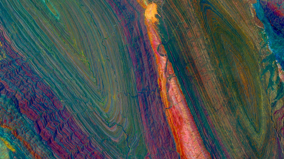
Experimenting with different band combinations is a great way of enhancing certain details in an image. For example, highlighting the structure of
sediment swirls or contrasting
rock properties. You can find new meaning in the imagery and create artistic takes on an otherwise common scene.
Understanding the electromagnetic spectrum and properties of the observed object are keys to making progress. This can be learned with trial and error, but takes time and can get quite tedious. The good news here is that there are many tutorials that explain these topics. A good starting point is to tweak existing band combinations which are already explained by scientists and peers.
Eventually, your experiments will become more meaningful and you'll grasp new ideas on how to process data. Outside of data-based processing, it's also worth seeing what you can do
with classic image editing software.
This post covers a range of concepts that might take time to master, but there are no limits in the world of EO data. Practice makes progress, and even small steps will bring new insights and improve your skills. The training process will produce data maps you can
share with the EO community. Discussing your work and results with a global community is great for making new connections and reflecting on your work.
There is a whole community of experts and enthusiasts on the
Soar platform and the
Soar Discord Server that are willing to help you on your journey. If you’re just starting out, check out some introductory blogs on
Remote Sensing and
Geographic Information Systems to get yourself familiar with the EO community.